Animation
A moving image is worth a million words.
Making images move is at the very heart of our work. Before we became a branding and marketing agency, we were a motion graphics boutique. Purposely small, purposely specific.
It takes a very specific skill and expertise to tell a story through graphic design and animation. Yet, the principles of storytelling still hold true, and with screens becoming ever-more prominent in our lives, brands need to tell better stories on more platforms for the foreseeable future.
-
We make moving images, in 2D and 3D, in AE and C4D. Most of our projects are composited and finished in After Effects, with assets imported from Illustrator, Photoshop and Cinema 4D.
-
Motion language is part of a brand’s DNA, just like color palette, font usage and information hierarchy. We define specific movements for each brand to make sure everything behaves cohesively across platforms and elements.
-
A specific and rather nerdy skill, toolkits are generally created as editable After Effects files that allow internal teams to switch out footage and/or tune-in information, while conforming to a hard-coded animation language.
⬇
AMC’s Immortal Universe
> Title Sequence
The animation of our logo for Anne Rice’s Immortal Universe is centered around the “publisher’s mark,” forged into a magical, world-defining wrought iron fence, straight outta New Orleans.
PARAMOUNT+ > Curtain Raiser
As part of the brand identity we crafted for the Paramount+ streaming service, we created an updated version of the cinematic “curtain raiser” that has played in movie theaters across the world for decades.
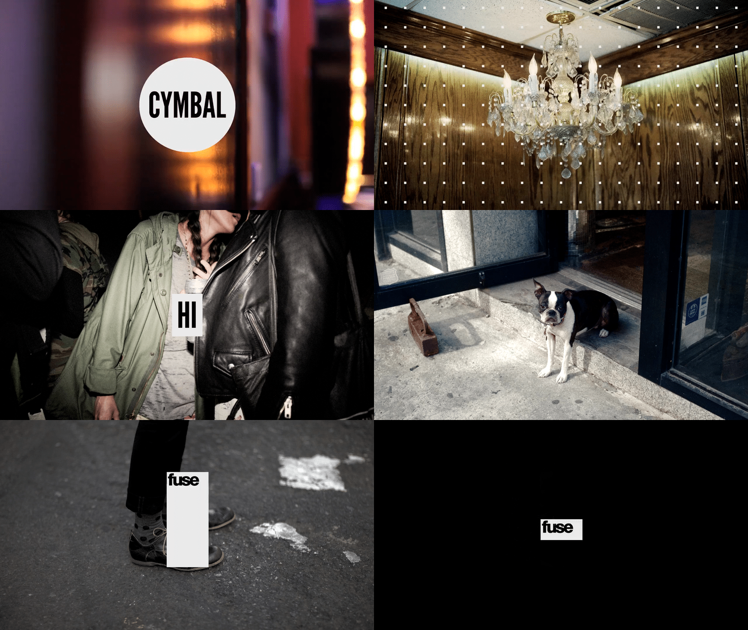
FUSE > Brand IDs
FUSE wanted to infuse – pun intended – their new brand with style, culture and attitude. These IDs playfully bring the hip new brand to life, IRL.
PEACOCK > Originals Open
Logo animations have become one of the most important brand elements for streaming platforms. They express personality through movement and sound. Our Peacock logo moves dynamically and whimsically, inspired by its namesake bird.
HPE > Motion Language
When Hewlett Packard Enterprise (HPE) was spun off as a standalone information technology company, we worked with Siegel+Gale on developing a motion language that is clean, crisp and dynamic, reflecting the company’s roots in technology.
APPLE TV+’s Circuit Breakers
> Title Sequence
Set in the not-too-distant future, Circuit Breakers depicts the central role of technology in our children’s lives–the good, the bad, the broken. Our title sequence embeds narrative easter eggs from various storylines into the inner workings of our digital devices.
A&E’s Bates Motel
> Title Sequence
Paying homage to iconic neon motel signs, our Bates Motel title sequence shows off the structural beauty of physical signs. Extreme close ups, unsettling camera angles, and ominous sound design hint at unsettling things to come.
TOYOTA Design Research
> Product Demo Film
Too top secret to post in its entirety, this product demo film for Toyota highlights the importance of the right vehicle to get you and your loved ones more space–and more freedom.
CNN’s ’Tis the Season
> Holiday Spot
It doesn’t get any more old school and tactile than frame-by-frame stop motion animation. Which seemed appropriate for a slate of classic holiday movies.
Paramount+ Brand Montage
Like its visual identity, the motion language for the Paramount+ brand is an extension of its cinematic roots. Pans, zooms and dollies serve as our animation blueprint, creating a modern brand with sophisticated behaviors.
INTEL CORE i7 > Product Spots
To highlight the benefit of its new CORE i7 chip to the global gaming community, we designed and animated a pair of purely graphic spots to illustrate its awesome power.
PopTV > Brand Montage
The wonderfully poppy animation language we developed for Pop TV – known primarily as the home of the award-winning hit comedy Schitt’s Creek –helped make red carpet awards shows and classic show reruns attractive for a younger audience.
PROMAX/GAMES > Conference Titles
We found inspiration in 8-bit visuals and refreshed our knowledge of classic arcade games to bring to life that world for the Promax/Games conference open.
INSIGHT > TV Spots
We directed and animated a campaign consisting of ten spots overall for Kentucky ISP INSIGHT. Ten scripts. Ten stories. One message: the purpose of cables is to connect humans.
MTV > Brand Montage
Our updated MTV brand identity is built around M, which is now modular and agile, expanding and contracting depending on context and platform.
FOX Japan > TV Spots
A fun collection of graphic brand IDs for FOX Japan that expressed the personality of the brand purely through dynamic movement.
MAGNOLIA NETWORK
> Brand Montage
We translated the iconic Magnolia Journal into a sophisticated media brand through dynamic layout and slick animation.
COMEDY CENTRAL > Brand Montage
A simple & structured framework for Comedy Central that lets the eclectic humor of its creators shine without getting in the way.
PROMAX 2019 > Conference Open
We integrated live-action elements into graphically bold environments that matched the new PROMAX brand, while playing with different aspects of the creative process.
ESPN’s The Jump
> Show Open
An example of how to bring a more illustrative graphic style to life, open for The Jump on ESPN is fun, short, and bouncy!
FREEFORM > Brand Montage
Exploring the imperfect process of becoming an adult, our animation style for Freeform is expressive, messy, and often seemingly incomplete.


